How DOOM Renders Colors
I’ve recently been reading through Game Engine Black Book: DOOM, a fascinating deep dive into the tech behind the legendary 1993 game Doom. Given that Doom is celebrating its 30th birthday this year, calling the technology antiquated would be an understatement. Yet the engine has some mystic enduring quality that compels programmers to port it to anything with a microprocessor.
That’s not to suggest that Doom’s engine was anything less than revolutionary at the time; it was arguably the most advanced game engine in ’93. Unlike its more advanced “true 3D” successor Quake (1996), however, the engine has essentially nothing in common with modern renderers. Yet the Doom engine is simple enough that us mere mortals can pick apart and understand its inner workings, making it easier to appreciate all the clever tricks that id Software used to get the game running on early 90’s home computer hardware.
Something I found particularly interesting is the way the engine handles color rendering. Doom was designed around VGA’s limited 320×200 resolution and 256-color palette, giving the game that crunchy 90’s look. id Software pulled out some clever techniques to make the most of these limitations.
The Color Palette
With a maximum of 256 unique colors on screen at once, each pixel can be represented by just one byte— its index in the palette. Since Doom is software-rendered and frame data is stored in regular memory before being sent to the display, you can imagine that the framebuffer looks something like this:
uint8_t screen[200][320];While VGA only lets you show 256 different colors on screen at once, you do at least get to choose what those colors are. The Doom engine loads its color palette at startup from the .wad file. The PLAYPAL “lump” stores the actual RGB values that will be displayed on screen for each 0–255 color index.
This is DOOM.WAD’s color palette, arranged here with index 0 at the top left and 255 at the bottom right.

All of Doom’s graphics are also stored in the .wad file alongside the color palette. Doom’s custom image format doesn’t use RGB values. Instead, each pixel in the image is stored as a one-byte color index.
Lighting
Where Doom gets really clever is with one of the engine’s cutting edge graphical features: lighting. In a Doom map, each area of the map (called a “sector”) has a light level somewhere between pitch black fully lit (in fixed steps). There’s also a neat effect called “light diminishing”, where areas further from the player appear darker than closer ones. It’s sort of like an early version of distance fog as seen in modern renderers.
Another touch adding realism is light diminishing. With distance, your surroundings become enshrouded in darkness. This makes areas seem huge and intensifies the experience.
While not the most eye-catching feature, it does add a lot of atmosphere to the game’s maps, especially in darker areas. Notice the color banding on the ceiling and floors in this screenshot.
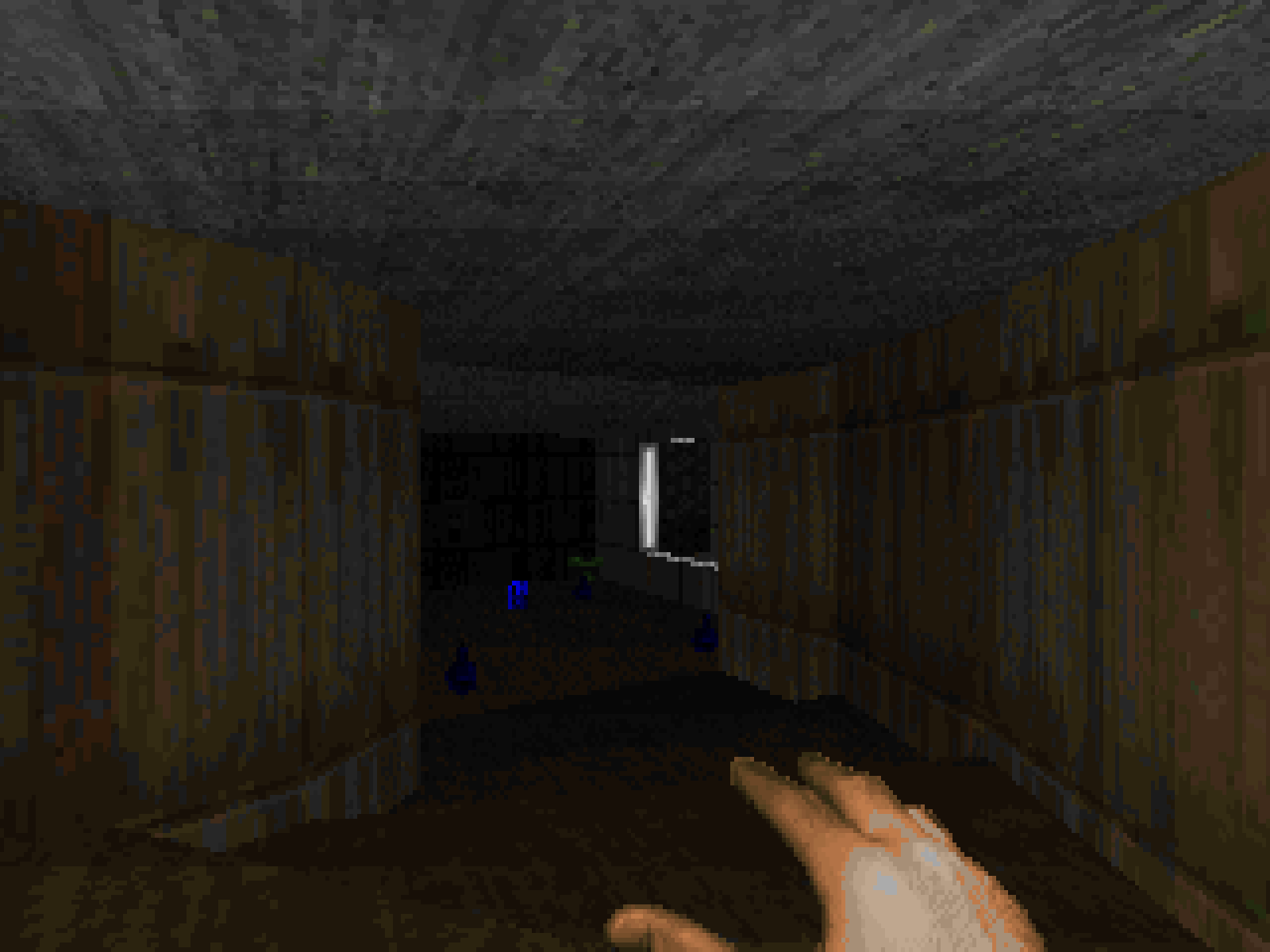
In a modern game engine, making some pixels on the screen darker is trivial. But for Doom, that’s a significant ask, for a few reasons. One, any time spent on color calculations would chip away at the game’s already thin performance budget. And two, thanks to that 256-color limit, the darkened color would then need to be mapped back to its nearest approximation in the palette. Doom elegantly solves both of these problems with one of its favorite tricks: pre-computing the hard part.
The DOOM.WAD file contains another lump called COLORMAP. This is the game’s lighting lookup table, visualized below.
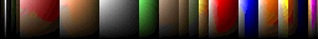
The COLORMAP uses other shades in the palette to approximate darkened versions of each color. There are 256 columns, one for each color in PLAYPAL (in the same order). Each row represents a brightness level, with index 0 being the brightest and 31 being the darkest. Look closely and you’ll see that the top row is essentially the color palette “unfurled”.
It’s not perfect— you can see how a lot of the colors devolve into a murky grey-brown as they get darker due to the limited shades available in the game’s color palette. But it gets the job done, and honestly I think it adds a bit of charm to the game’s visuals.
During the rendering process, the game computes the brightness level that each pixel needs to be rendered at, taking into account the containing sector’s light level, distance from the viewport, and other light-affecting effects. That value and the color defined in the texture are plugged into the COLORMAP to get the appropriately darkened color, which can then be written to the framebuffer.
// pseudo-code
uint8_t ShadeColor(uint8_t color, int lightlevel) {
	return colormap[lightlevel][color];
}Screen Tints
Another interesting quirk is the way the engine handles screen tinting, like how the screen turns progressively redder as you take more damage. Again, nowadays blending colors at runtime is trivial, but not for Doom. To implement this, id reused a trick from Wolfenstein 3D.
The PLAYPAL lump actually contains not one, but fourteen different versions of the same color palette. The first is the base palette which the game uses most of the time. Then there are some red-tinted versions for indicating damage taken and the berserk effect, some yellows for picking up items, and a green for the radiation suit. Whenever a screen tint needs to be displayed, the game swaps the base palette out for a tinted version.

This approach does have some downsides, mainly that it’s impossible to blend different tints together. But for Doom’s needs, it works remarkably well.
If you’d like to experience Doom’s classic renderer on modern hardware, then I’d recommend checking out the Chocolate Doom source port.