I Am Here to Complain About the iOS 16 Lock Screen
With WWDC ’23 just around the corner, I figured now was a perfectly punctual time to talk about last year’s hot new features. iOS 16 was the first update in quite a while to touch the lock screen in any substantial way. Now that we’ve all had plenty of time for the novelty to wear off, I have to say that I remain thoroughly underwhelmed.
There’s no doubt that lock screen customization in iOS was well overdue, since previously the only option you had was changing the wallpaper. And if all you were looking for was more options, then iOS 16 probably left you pretty satisfied— there’s now fonts, colors, and widgets galore to choose from. But from my perspective, I think Apple fumbled the execution on this one.
There were lots of big and small tweaks to the lock screen, but one of the foundational changes to the system is that you can now have multiple lock screens and switch between them, including via automation with Shortcuts and Focus. This sure sounds like something useful, but one year later I’m still rocking a single lock screen. I’m sure this feature is useful to someone, but for me it’s just added friction to the simple process of changing my phone’s wallpaper. There’s been substantial usability improvements in subsequent patches, but the whole system still reeks of awkwardness, like how there’s still no way to reorder your lock screens if you have more than one.
Speaking of wallpapers, iOS’s once-great set of built-in wallpapers has been steadily whittled down with each release, and now we’re left with a handful of mostly-mediocre backgrounds, which are now called “collections” for some reason (though I am surprised the dynamic wallpapers from iOS 7 have made it this far). If you’re not a fan of those then you could, of course, instead choose one of the absolutely hideous and bizarrely configurable new emoji wallpapers. But if you actually want your phone to look… good, and aren’t interested in gimmicks, then you’re going to need to bring your own photo, or choose one of the new “Color” backgrounds, which are actually quite nice.
But the big iOS 16 lock screen feature was widgets, which I’m going to use as an excuse to segue into one of my favorite UI design topics: affordances.
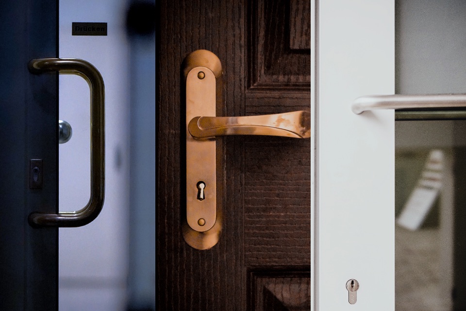
Affordances are the environmental cues that tell you what possible actions you can take in that environment. A classic real-world example is the door handle: not only does it let you know that the segment of wall it’s attached to is a door, but the handle’s shape also tells you whether you need to push, pull, or twist to open the door.
You tend to hear the term “affordance” mostly applied to digital design, where those cues are more abstract. For example, consider this link, which is styled differently from the rest of this text to indicate that it’s clickable.
Affordances are a big deal in UI design, and understandably it’s a topic that many people have strong opinions on. On one side you have the function-over-form purists who insist that every button must have the exact same bevel as every other button, and then go on to explain how Windows 95 was the peak of all UI design ever. At the other extreme you have trendy Dribbble-bullshit that expects you to intuit that this bit of grey text that’s a slightly different shade of grey from all the other grey text is actually a clickable button. I tend to fall somewhere between these two blatant straw men.
Good UI design exhibits many different qualities, which can sometimes conflict with each other: ease of use, discoverability, visual hierarchy, efficient use of screen space, and just making things look good, to name a few. So while I’d say that in general everything should have good affordances, and in general those affordances should be reasonably consistent, there are plenty of good reasons to make exceptions.
Complex software, for example, can usually get away with skipping on affordances for core functionality if it streamlines the experience for experienced users. Learning those UI interactions just becomes part of the initial learning curve (which the software was going to have anyway), and you’ll have to either trial-and-error you way into basic competency or RFTM.
On the other end of the learning curve, I’d say it’s fine for advanced functionality to remain un-afforded so long as there’s an obvious-but-slow way of accomplishing the same task. For example, lots of software supports drag-and-drop as a faster alternative to digging through menus, but that doesn’t mean the UI should be carpeted in drag handles.
Let’s use the iOS home screen as a case study. If you want to edit your home screen, you need to tap and hold on the screen. There’s no affordance for this, it’s just something you learn when you get your first iWhatever. Apple could have put an explicit “edit” button or a label on screen, but that would have wasted space and cluttered a screen you’ll be seeing constantly. Once you enter jiggle mode, the icons start to shake, which is a clever way of letting you know the icons are ready to move, and that touching an icon will start a drag instead of launching the app. Apps also get an obvious “delete” button in this mode. There’s a “hidden” feature here as well: while dragging one icon, you can tap other icons to pick them up as a stack. It’s a nice time saver once you find it, but you’re not missing out on any functionality if you didn’t know that.
With that overlong digression out of the way, let’s go back to the lock screen and analyze the widgets UI through the lens of affordances.
Editing your lock screen requires the same long-press as the home screen, which has no affordance. This is fine.
Once you’re in, there are rounded rectangles drawn around each customizable part of the lock screen, which I think read well enough as tappable areas.
Tapping the bottom section lets you start editing your widgets. There’s a sheet that opens where you can add new widgets, and a clear “delete” button on existing widgets to remove them.
One thing that the widgets here don’t do is shake when you’re in “edit mode” like the icons on the home screen, so it’s not at all clear that you can rearrange them once placed. However, there’s a much bigger hidden interaction here, a dark secret that took me half a year to accidentally discover.
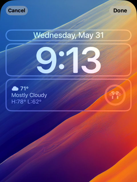
Did you know that you can tap on these widgets to open an options menu?
If this is your first time seeing this, you wouldn’t be the first.
The kicker is, not all widgets have options, and tapping one that doesn’t does nothing. After some judicious pixel peeping, I can confidently say that there is absolutely zero visual difference between a widget that can be edited, and one that can’t. This feature is so well hidden it may as well be an Easter egg.
The lock screen widgets suffer from a lot of the same warts as the home screen widgets from iOS 14, but with their own set of new problems added on top. Sure, on the whole, I’d take the new lock screen over the old one. But the level of quality is just not up to the standard that we usually expect from Apple.
There’s an idea that’s been going around for a while that Android will get a new feature first, then Apple will drop a better, more polished version a few years later. Whether that’s more true than false is debatable, but the idea hinges on the idea that Apple’s version is actually polished, and this just isn’t.